Actively looking for work

Product
Designer
& Creative
Strategist

User-centered, research based, highly functional design solutions to complex problems, using a multi disciplinary, agile approach.

Get in Touch

Introduction

I’ve not had a conventional journey to where I am, but I believe my experiences have given me an ability to approach design challenges uniquely, from a number of different angles.

I’ve worked as a responsible investments analyst in New York and Amsterdam; I’ve designed covers for a series of sci-fi books and a former Prime Minister’s war chronicles; helped create a brand identity for one of London’s most iconic buildings; and I’m currently working as a senior product designer for a local government organisation as part of a digital taskforce, while also maintaining a small practice for independent creators.

Case Study 01

A new intranet for the Royal Borough of Greenwich

RoleSenior Product Designer
Year2022
Timeline18 months
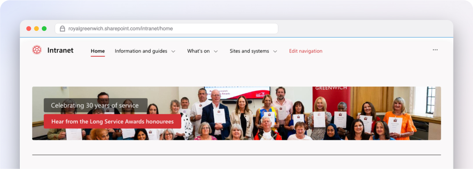
The new Royal Borough of Greenwich intranet homepage shown in a browser window, with a banner celebrating 30 years of service

The brief

The Challenge

Staff were working around four separate intranets to find and share information. Content was hard to find, hard to use, and hard to trust — so people asked colleagues instead, then kept their own private copies elsewhere. Access relied on a cumbersome "remote desktop", which only added friction.

The Solution

Replace all four intranets with one, and change how teams publish and maintain their content — so staff turn to the intranet first for support and opportunities. A new homepage separates the "need to know" from the "nice to know", built on a fresh category → topic → task information architecture, tested with staff until we were confident it worked.

8%
Abandoned searches (down from 30%)
2%
Dead clicks (down from 23%)
4 to 1
Intranets unified — one trusted source

Understanding the problem

We mapped how staff actually looked for information across four intranets — through interviews, analytics and open card sorting.

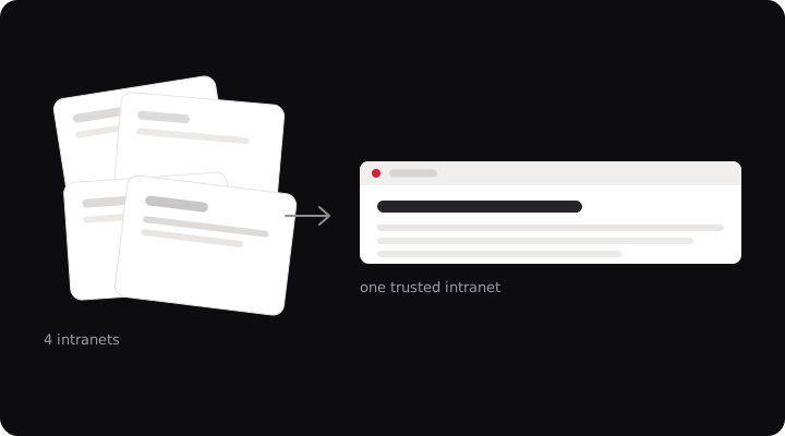
Illustration of four scattered intranet cards converging into one trusted intranet

Discovery

Open card sorts revealed staff grouped content by the task in hand — not by the team that owned it.

Key Insight

Staff hadn't stopped trusting the content — they'd stopped trusting it was current. So they asked a colleague and quietly kept their own copy.

A new information architecture

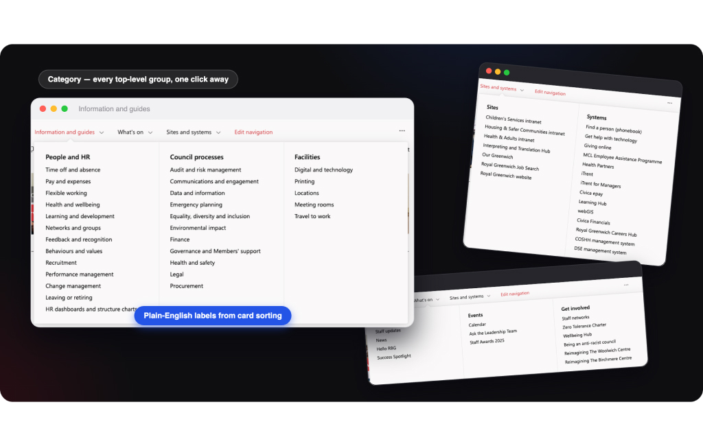
We replaced four overlapping structures with a single wayfinding model — category → topic → task — and built the page templates to match, so every screen makes ownership and freshness obvious.

  • A single category → topic → task model for the whole council
  • Plain-English labels tested with staff — not internal team names
  • "Need to know" and "nice to know" kept visually distinct
  • Pages that surface content owners and last reviewed dates
Screens of the new navigation showing categories, topics and tasks with plain-English labels
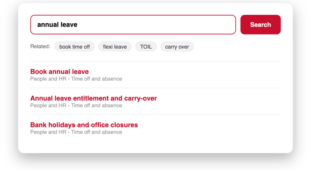
Search results for annual leave showing related terms and clearly labelled results

Findable by design

Search is where trust is won or lost. By reworking related search terms and content metadata, we cut abandoned searches from nearly 30% to 8%, and dead clicks from 23% to 2% — staff find the right thing on the first try, far more often.

Ease, satisfaction, trust and perceived value were tracked through ongoing qualitative research — and all improved markedly after launch.

Built to public sector standards

Accessibility

  • WCAG 2.1 AA across every page template
  • No remote desktop — works on any device, anywhere
  • A clear heading structure for screen readers
  • Meaningful link text and plain-English labels

The Impact

"Staff finally have one place they trust. The intranet has become the front door to working at the council — not a last resort."
Julian Vane
Head of HR

Case Study 02

Building a reusable transactions platform

RoleSenior Product Designer
Year2025
Timeline10 months

The brief

The Challenge

Modern fintech apps often suffer from feature-bloat, creating high cognitive load for users who simply want to manage their daily finances. Ethos aimed to strip away the noise and provide a tranquil, yet powerful banking experience.

The Solution

We implemented a "contextual-first" UI that surfaces information only when needed. By utilizing tonal depth and intentional asymmetry, we guided users through complex financial transactions with the ease of flipping through an editorial magazine.

45%
Retention increase
12ms
Avg. load time
98%
User satisfaction

Business case

A deep dive into the methodology behind Ethos. From initial sketches to the final lithographic digital finish.

Dark textured artwork from the discovery phase of the Ethos project

Key Insight

"Users don't want to manage money; they want to feel secure about their future."

01. Discovery

Analyzing the friction points in the competitive landscape.

Architectural Foundations

We moved away from the standard card-based UI. Instead, we treated every screen as a canvas. The design system uses a strict 8px grid but allows for organic movement through whitespace.

  • Intentional asymmetry for visual hierarchy
  • High-contrast typography for accessibility
  • Tonal layering instead of heavy shadows
Design detail: warm-toned lantern artwork
Design detail: golden textured material study
Final brand artwork: In a Design — Safe Work emblem on a dark background

The Impact

"The Editorial Gallery didn't just design an app; they defined our brand's digital soul. The minimalism is not an absence, but a presence of clarity."
Julian Vane
CEO @ Ethos Fintech

Case Study 03

A new tool for street services allocation

RoleSenior Product Designer
Year2023
Timeline10 months
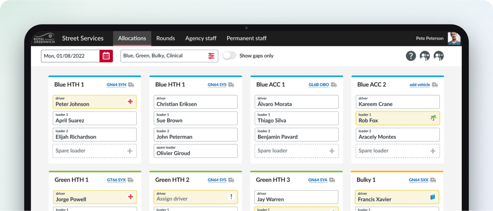
The street services allocation dashboard showing crews, rounds and vehicle assignments

The brief

The Challenge

Street services ran on a paper-based allocation system. As the operation grew it became harder to maintain, error-prone, and near-impossible to use out on the mobile units — supervisors rostered frontline crews with pen, paper and phone calls.

The Solution

One platform for supervisors to view staff absence, record updates and allocations, and see who's signed in and out — bringing availability and allocation into a single, reliable record that works on the units, not just at a desk.

The allocation journey

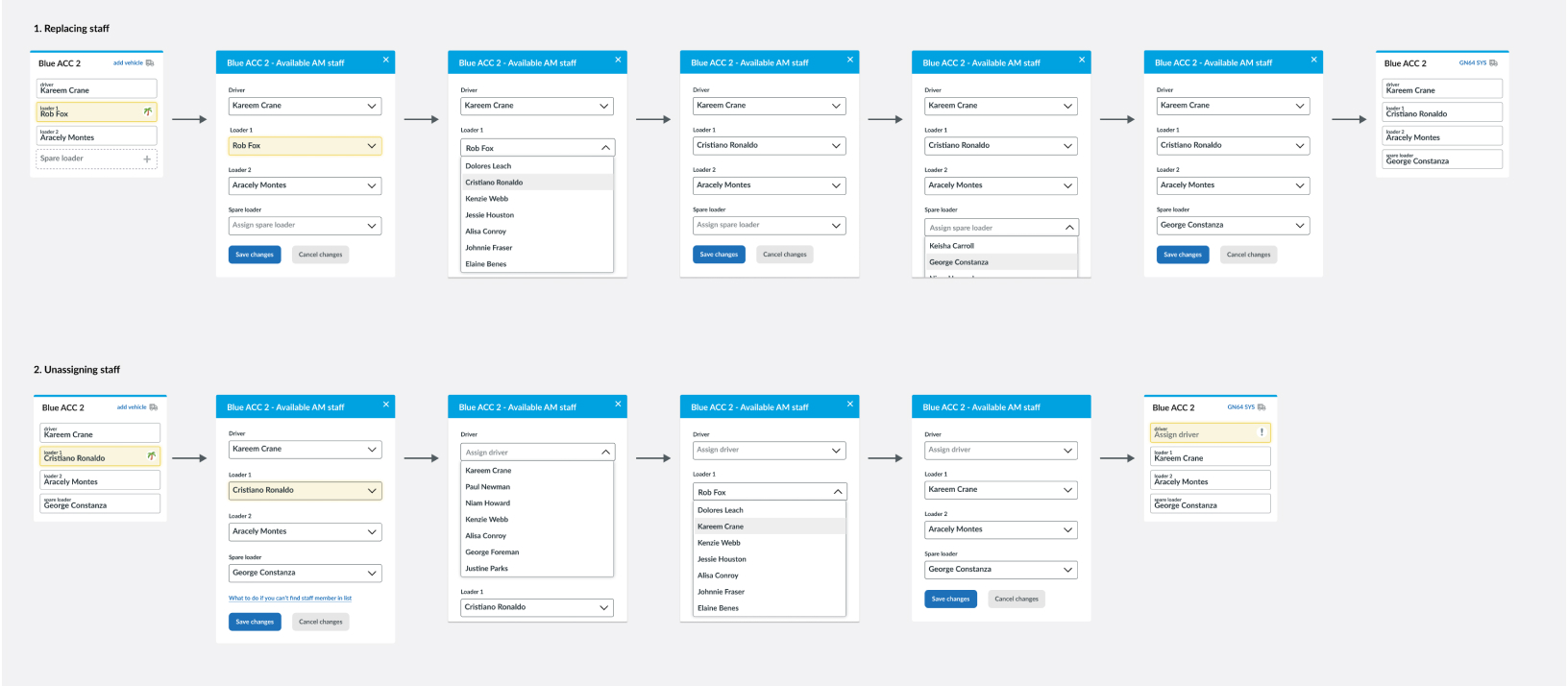
The whole day runs through four moves — each one captured once and visible to everyone, replacing a stack of paper sheets and a round of phone calls.

  1. 1. See who's available

    Availability and absence for every crew member in one view.

  2. 2. Record absence and updates

    Captured once by a supervisor, instantly reflected everywhere.

  3. 3. Allocate to shifts

    Assign crews to rounds and vehicles in a couple of taps.

  4. 4. Track sign in / out

    Live status through the day — who's on shift, who's finished.

A grid of application screens covering availability, absence, allocation and sign-in

A component system built for the depot

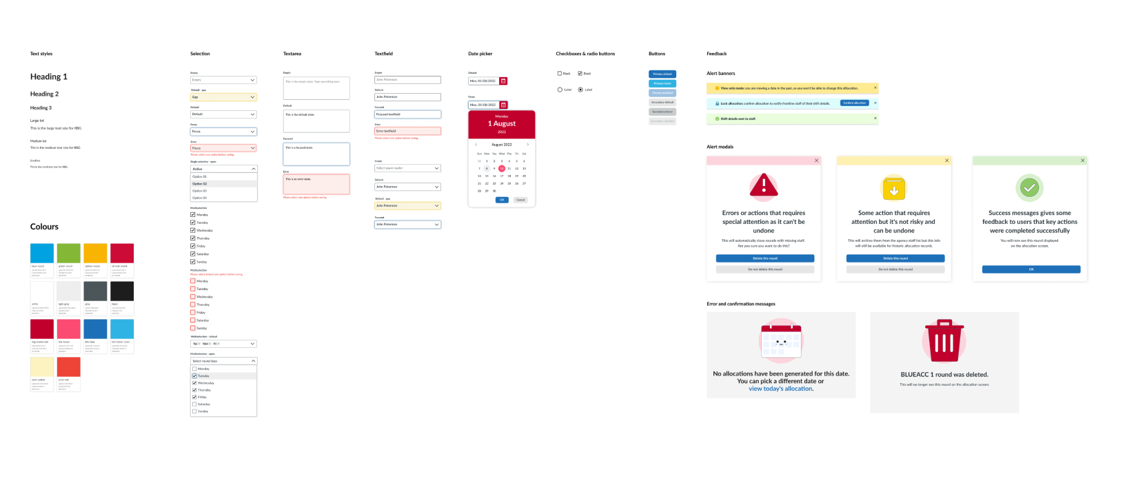
The tool gets used in a cab, in a yard, in gloves and in sunlight — so the system leans on large targets, a small, high-contrast status palette, and as little typing as possible.

The component library: status colours, buttons, cards and form patterns designed for outdoor use

Usable in a cab, in gloves, in sunlight

Accessibility

  • WCAG 2.1 AA, with 48px+ targets for gloved hands
  • High-contrast status colours tested in direct sunlight
  • Status shown by colour and label — never colour alone
  • Tap-first: allocate and update with almost no typing

The Impact

"The board replaced a wall of paper. Supervisors can see the whole depot at a glance and spend their mornings running the service, not rebuilding the rota."
Julian Vane
Street Services Supervisor

Case Study 04

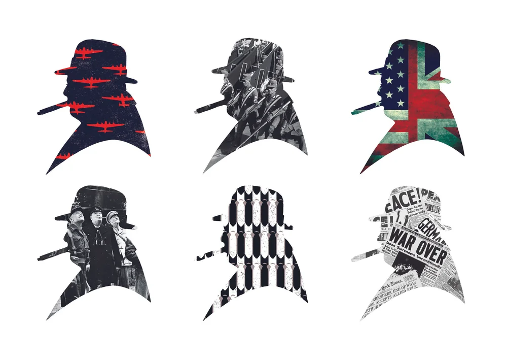
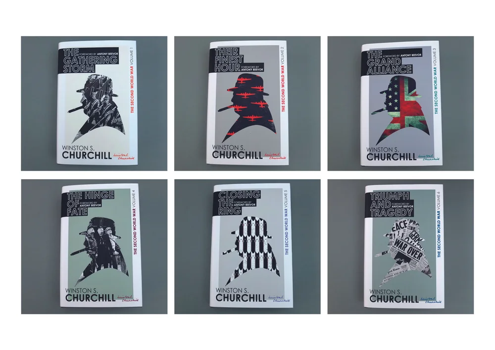
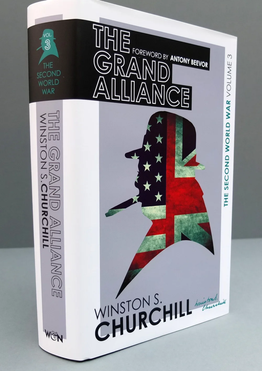
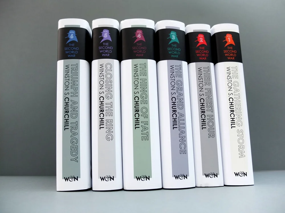
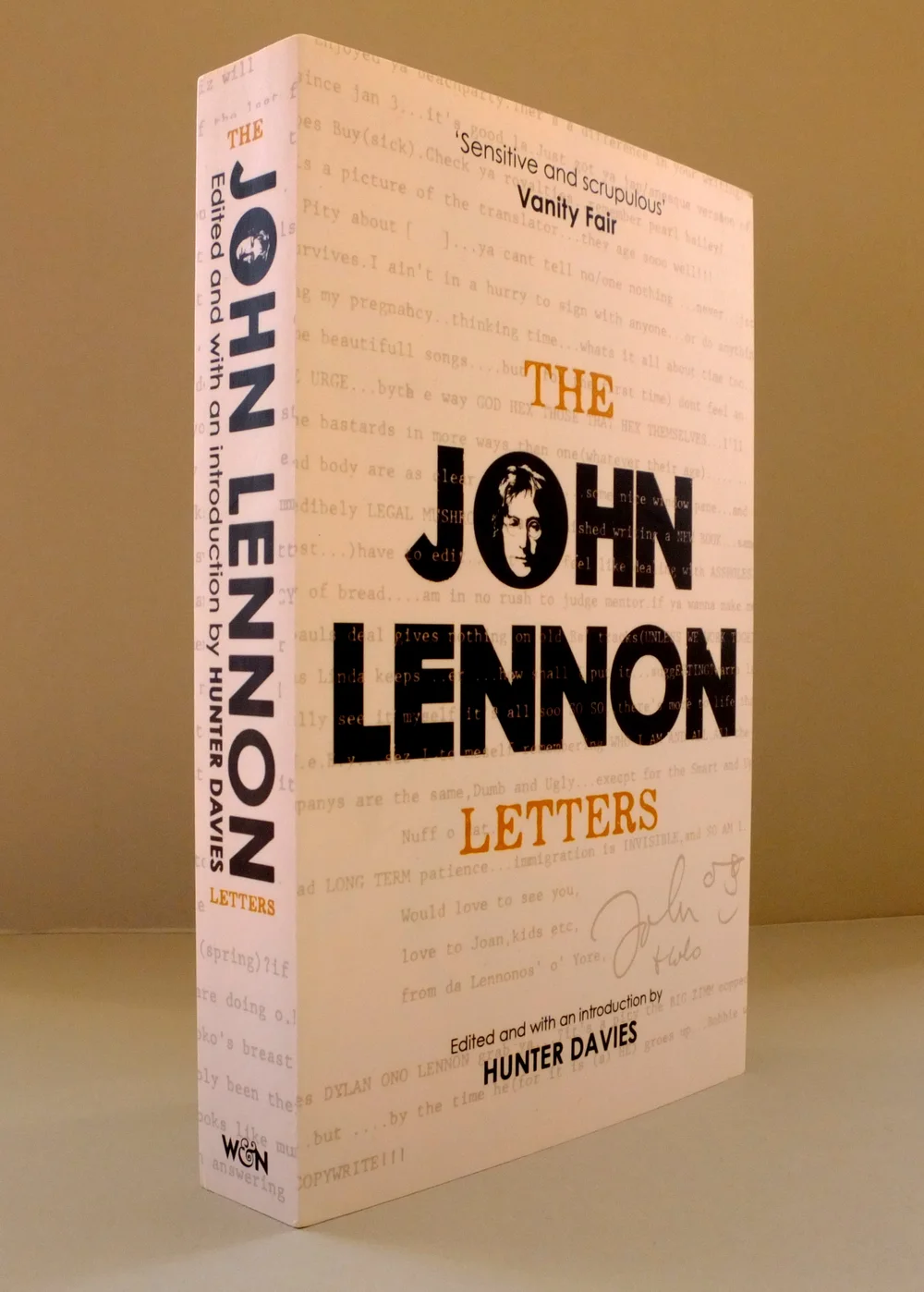
Some book covers from a past life

RoleBook cover designer
Year2019
Timeline18 months

Selected Works